A Logo With Roots in a Family Service Station
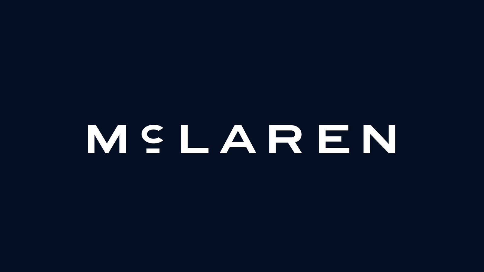
McLaren has unveiled a new logo, and unlike many corporate rebrands that feel detached from a company's past, this one reaches straight back to the brand's earliest days. The new wordmark is inspired by the sign that once hung above the service station owned by the parents of founder Bruce McLaren. That station was located in Auckland, and it holds a special place in McLaren history: it is where the car Bruce drove to his first race victory is said to have been built. In other words, the new logo is not simply a stylistic refresh. It is a direct nod to the physical place where the McLaren story began, long before the name became associated with Formula 1 glory, Indianapolis 500 victories, and Le Mans campaigns.
The connection gives the rebrand a narrative that few automotive logo changes can claim. Bruce McLaren's parents, Les and Ruth McLaren, ran the service station, and that modest business became the launchpad for a racing legacy. By adopting a typeface that echoes the signage from that Auckland garage, McLaren is threading its modern identity back to its origins. The move also serves as a reminder that the company's heritage is not just about race wins or engineering milestones, but about family, hard work, and the kind of grassroots setting where a future racing legend first turned a wrench.
The New Typeface and the McL 6GT Connection
The updated font may look familiar to anyone who has been paying close attention to McLaren's recent vehicle reveals. It is the same typeface seen on the back of the company's new manual McL 6GT supercar. However, the story behind the lettering goes deeper than a simple design choice for a single model. McLaren's press release included newly edited images of the 6GT featuring the fresh "McLaren" script on its rear, replacing earlier images that showed "McL 6GT." That change suggests the new wordmark is not just a digital exercise or a one-off for a press kit. It is likely to appear as a physical badge on the brand's future road cars.
That includes the performance SUV that McLaren has now confirmed. While the company has long been known for low-slung supercars, the expansion into an SUV segment means the new logo will have to work across a broader range of vehicle shapes and sizes. Applying a heritage-inspired script to an SUV might seem like an unusual pairing, but it also signals that McLaren wants its entire lineup to share a visual identity rooted in the same origin story. The badge will need to look at home on a track-focused machine and on a family-capable performance vehicle, all while carrying the weight of the company's Auckland beginnings.

What Is Staying the Same
The Speedmark Badge Endures
For enthusiasts who have grown attached to McLaren's existing branding, the news is not a complete overhaul. The Speedmark — the small, stretched-moon badge that often sits on the noses of McLaren cars — will stick around. So will the Papaya Orange color scheme that has become a signature part of the brand's identity, particularly in racing contexts. That continuity matters. It means the rebrand is additive rather than destructive, layering a new wordmark on top of visual elements that already carry recognition and emotional weight.
The decision to retain the Speedmark and Papaya Orange also suggests that McLaren is not trying to erase its recent history. Instead, the company appears to be connecting two eras: the modern, technology-driven McLaren that competes at the highest levels of motorsport, and the original, family-run service station that started it all. The result is a brand identity that can point to both a historic garage sign and a contemporary supercar without contradiction.
Racing Will Carry the New Look Too
The new logo is not limited to the road-car side of the business. It applies across the entire McLaren automotive dynasty, which means it will appear on team kit, merchandise, and liveries wherever McLaren goes racing. That includes Formula 1, IndyCar, and the World Endurance Championship come 2027. For a brand whose reputation is inseparable from motorsport, the logo change is therefore a global statement. It will be seen by millions of fans across different series and different continents, all tied together by a single script inspired by a service station sign in New Zealand.
McLaren has also made no secret of its ambition to complete the motorsport Triple Crown again. That means winning the Monaco Grand Prix, the Indianapolis 500, and Le Mans. The new logo will travel with the team as it pursues that goal, appearing on cars, uniforms, and equipment in each of those iconic events. Whether the rebrand brings any luck is, of course, impossible to say, but it does give the team a visual through-line as it chases one of the sport's most difficult achievements.
Mixed Reactions and the AI Question
As is typical whenever an automotive brand changes something visible, not everyone is pleased. Internet commenters and even some within Jalopnik's newsroom have argued that the new logo looks more like branding for a luxury fashion house, a hotel chain, or a skincare manufacturer than for a race team. That criticism is not unusual for modern corporate typography, which often favors clean, elegant scripts over aggressive, motorsport-inspired lettering. Some fans may feel the new wordmark lacks the edge they associate with McLaren's racing identity.
Still, the response is not universally negative. Jalopnik's own writer considers the logo pretty cool and predicts it will fade into the collective background in about two Grands Prix' time. That is a reasonable expectation for most rebrands: initial controversy gives way to familiarity, and eventually the new design simply becomes part of the scenery. The heritage story behind the typeface may also help it win over skeptics once they learn where it comes from.
There is also a detail that sets this rebrand apart from many recent logo changes: unless Les and Ruth McLaren were secretly time travelers, this is one corporate logo that definitely was not cooked up by AI. In an era when AI-generated design is increasingly common and often criticized for lacking human context, McLaren's new wordmark has a clear, documented human origin. That alone might be enough to make it a win for some observers.

Why the Story Matters
Automotive branding often relies on abstractions: speed, luxury, innovation, performance. McLaren's new logo takes a different approach by grounding itself in a specific, tangible place. The service station in Auckland was not a glamorous facility. It was a family business where a young Bruce McLaren grew up around cars, and where the vehicle he used to win his first race was reportedly built. That story gives the new script a sense of authenticity that a purely focus-grouped design might lack.
It also reinforces the idea that McLaren's identity is not only about what it builds today, but about the people and places that made those achievements possible. The logo may have its critics, and it may take some getting used to, but it carries a narrative that stretches from a modest New Zealand garage to the world's most famous racing circuits. For a brand that competes in Formula 1, IndyCar, and the World Endurance Championship, that kind of long-view storytelling is a powerful asset.
Ultimately, the new McLaren logo is a reminder that even in a high-tech, global industry, origin stories still matter. The Speedmark will remain, Papaya Orange will remain, and the cars will keep wearing badges that connect them to a family service station on the other side of the world. Whether fans embrace the new script immediately or need a few races to warm up to it, the design has a history behind it that is difficult to dismiss. And in a world increasingly shaped by artificial intelligence, a logo with a genuine human story is something worth noting.
This article is based on reporting by Jalopnik. Read the original article.
Originally published on jalopnik.com