A global yardstick for a universal symptom
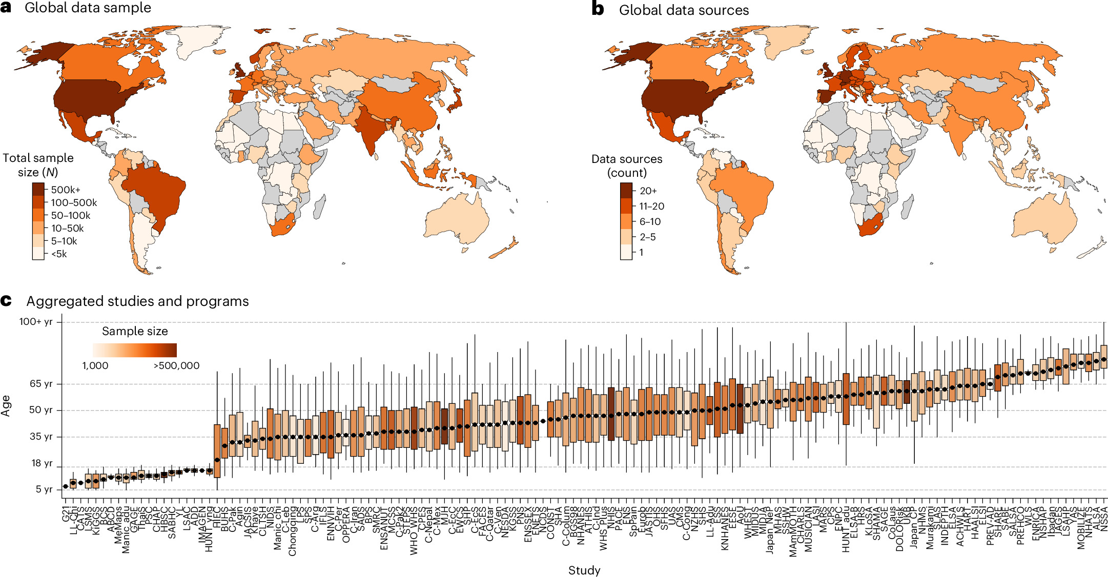
Pain is one of the most frequently reported reasons people seek medical care, yet medicine has long lacked a shared benchmark for how much of it is typical at a given age, for a given sex, in a given part of the body. A study published online in Nature Medicine on 5 October 2026 moves the field substantially closer to that benchmark. According to the paper's published summary, the work presents global age- and sex-specific reference curves for 11 pain sites, built from data on 6.1 million individuals living in 118 countries.
The scale is unusual for pain research, which has traditionally relied on smaller cohorts, single-country surveys or clinical samples that are difficult to compare across borders. By assembling information at this magnitude and geographic reach, the authors appear to be offering something closer to a population-level norm — a way to ask whether a person's pain experience looks ordinary or exceptional relative to peers of the same age and sex anywhere in the world.
Why pain has resisted a common standard
Unlike blood pressure, cholesterol or body mass index, pain has no instrument that reads it directly. It is subjective, recalled, and shaped by culture, language, expectation and the wording of the question used to elicit it. One survey might ask about pain in the past week, another the past year; one might probe severity on a ten-point scale, another simply ask whether pain was present at all.
That measurement scatter has real consequences. Prevalence figures for chronic pain have varied widely between studies, and comparing a rural district in one country with a metropolitan area in another has often meant comparing methodologies as much as health. Reference curves, in principle, cut through part of that problem by expressing pain as a function of age and sex rather than as a single headline number.
The growth-chart analogy
Paediatricians solved a similar problem decades ago with growth charts. Rather than asking whether a child's height is "normal" in the abstract, a clinician plots it against a distribution built from large reference populations and reads off a percentile. The pain curves described in this paper follow that logic: they describe how pain at each of the 11 sites is distributed across the lifespan, separately for men and women, so that an individual observation can be positioned against a broader pattern instead of judged in isolation.

What the study assembled
The headline figures from the published summary are worth restating precisely, because they define what the paper can and cannot support:
- 6.1 million individuals contributed data, a scale that gives the curves statistical weight at fine-grained age and sex intervals.
- 118 countries are represented, making this a genuinely international dataset rather than a wealthy-nation sample with a few additions.
- 11 pain sites are covered, spanning multiple regions of the body rather than collapsing everything into a single "pain" category.
- Age- and sex-specific curves are the central output, rather than one pooled prevalence estimate.
Breaking pain into separate anatomical sites matters clinically. Back pain, headache, joint pain and abdominal pain have different causes, different trajectories across life and different implications for treatment and disability. Lumping them together has historically obscured exactly the patterns that clinicians need.
Age and sex as organising axes
Age is the axis along which pain behaviour changes most predictably. Musculoskeletal complaints tend to accumulate with years lived, while other pain types peak earlier and recede. A curve that plots prevalence or severity against age turns those broad impressions into something quantifiable, and it makes inflection points visible — the ages at which a given pain site becomes markedly more or less common.
Sex adds a second dimension. Differences between men and women in the frequency and reporting of pain have been documented for years, but usually within individual studies with limited reach. Reference curves built separately by sex allow those differences to be examined systematically and, potentially, compared across regions to see whether they are biological constants or vary with social and economic context.

Regional variation and questions of equity
Coverage of 118 countries opens the door to comparisons that were previously guesswork. Patterns of pain are entangled with occupation, income, access to care, conflict, climate and the physical demands of daily life. Where curves differ between regions, the differences invite explanations that go well beyond biology — and where they converge, that convergence is itself a finding worth noting.
There is also a data-equity dimension. Global health datasets have often been thinnest where disease burden is heaviest, and a study that reaches into more than a hundred countries raises the question of how representative each national contribution is. Reference curves are only as trustworthy as the sampling behind them, and the paper's methods will be scrutinised closely for how it handled nations with sparse or non-representative survey infrastructure.
How reference curves could be used
Assuming the curves hold up to replication and scrutiny, several applications follow naturally:
- Clinical interpretation: giving clinicians a population anchor when assessing whether a patient's pain burden is unusual for their age and sex.
- Research standardisation: allowing studies in different countries to report pain against a common reference rather than bespoke local baselines.
- Health system planning: informing where pain services, rehabilitation and analgesic provision are likely to be needed as populations age.
- Burden estimation: sharpening global and regional estimates of pain-related disability, which remain contentious.
- Hypothesis generation: flagging regions or demographic groups whose curves deviate from expectation, pointing to questions about environment, work and access to care.

Caveats worth keeping in view
Reference curves are descriptive tools, not causal explanations. They show how pain is distributed; they do not explain why. Pooling data from many countries also means harmonising different survey instruments and definitions, and residual heterogeneity can survive even careful statistical adjustment. Self-reported pain is additionally vulnerable to recall bias and to cultural differences in willingness to report symptoms, which can make a country look healthier or sicker than its underlying biology warrants.
Cross-sectional data, whatever its size, also cannot distinguish between age effects and cohort effects — whether today's 60-year-olds report more pain because they are 60, or because of something specific to the generation they belong to. Longitudinal follow-up would be needed to separate the two.
What to watch next
The immediate test for any reference standard is whether independent datasets reproduce it. Expect follow-up work testing these curves against national health surveys, electronic health records and cohort studies, along with debate over whether the 11 pain sites chosen capture the burden that matters most. If the curves survive that scrutiny, they could become a quiet but durable piece of infrastructure for pain research and clinical practice — the kind of reference that, once established, is used without much comment and rarely replaced.
This article is based on reporting by Nature Medicine. Read the original article.
Originally published on nature.com